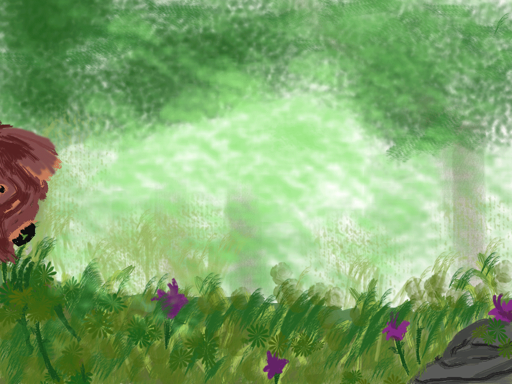
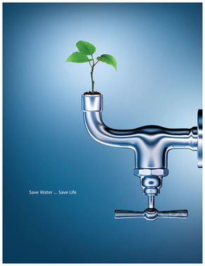
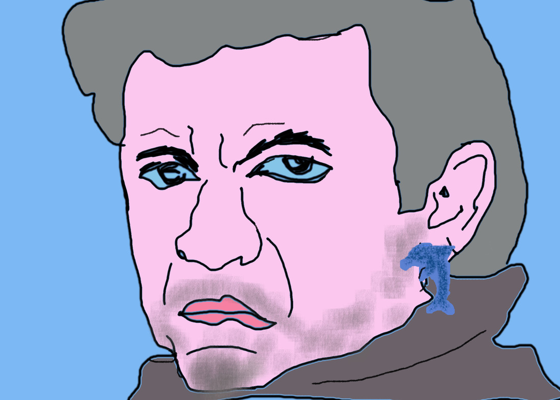
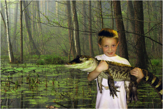
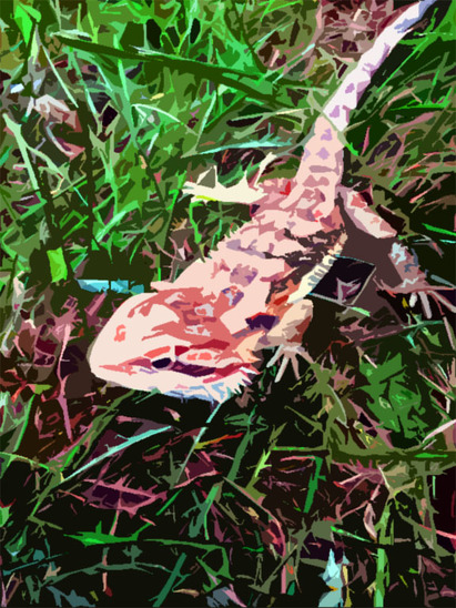
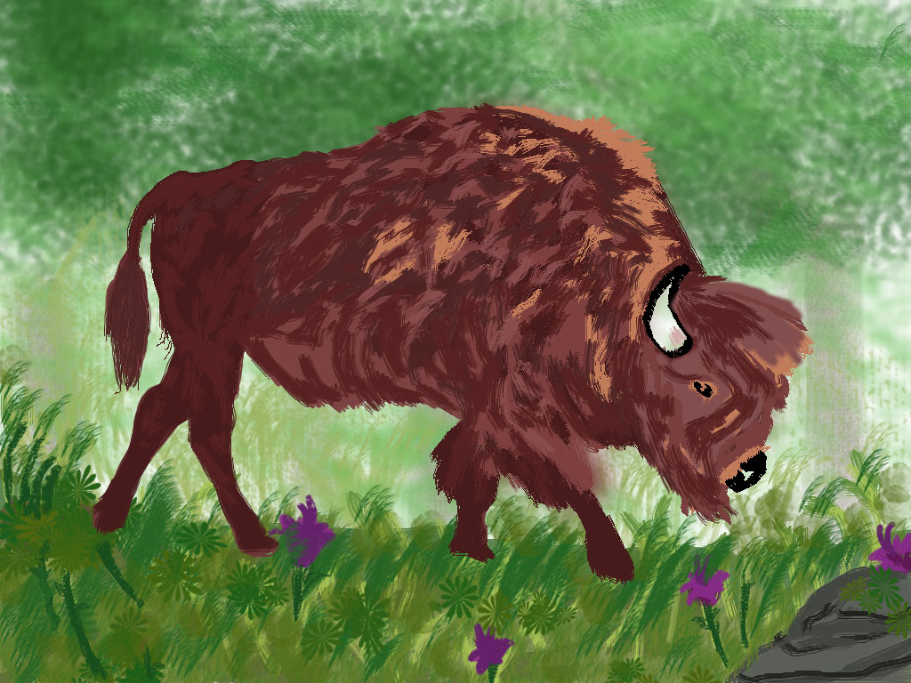
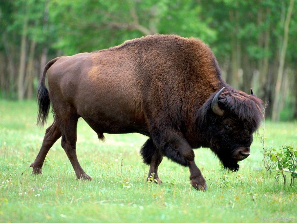
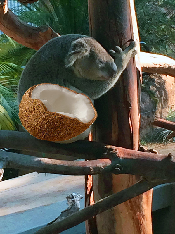
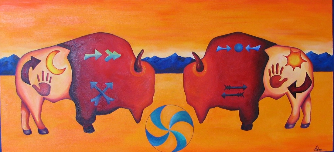
Over the course of this semester I learned how to use Photoshop, the walcom tablets and a little bit of adobe illustrator. Before this class I had no idea how to use Photoshop and I learned how to do the basics of image editing. I learned how to change the color of photos, apply different filters, transform images and move images. My favorite project was probably either the painting project or the characture project. I thought these were fun because they give you a lot of room to be creative and I thought they turned out pretty cool. I would like to do more of this kind of picture in the future because even though you start off tracing an image, there is a lot of things you can change about it to make it a new picture. The tracing helps to get the structure and the proportions down. Since I have always liked drawing, my favorite digital art medium is digital painting. If I had another semester of this class I would like to do more digtal painting and I think I could improve myself a lot because I understand how to use Photoshop more then I did at the beginning.
I Like this poster because It conveys a message in a creative way. The plant is growing out of the faucet to show that the water is vital to the plants survival. The faucet is representing the water , which is the goal of this design. The colors used were blue, white and green. The blue is a good color for a design about water and when combined with the green makes you think of nature. The white fading out of the blue and the shiny faucet just adds a nice touch. The words are small so they don't take away from the picture but they are visible, in the middle of the design. I am not sure what I will use in my design yet but I might add natural looking colors like this one.
In this project I took a picture of the Musician , Johnny cash and turned him into a cartoon character. I started it by manipulating some things on his face. I made his mouth more of a frown and his eye brows more creased. After that I traced the outline of his face and deleted the original photo, similar to what we did in the painting project. After that I added color to every where on the face but I kept the color values similar. I also added the dolphin earning and facial hair to make the picture more interesting to look at.
I combined a picture of me holding an alligator with a picture of the swamp. I tried to make the lighting and pix-elation as similar as possible to give off the appearance of me being in the swamp holding the alligator. the picture of me is a lot lower quality then the swamp picture so it was a challenge to make them fit together. During this project I learned how to manipulate photos in some ways you normally wouldn't think to do such as blurring the back ground and changing the contrast in certain parts to make it stand out. the lighting still looks different in the two photos but it looks alot better then when I first put these two pictures together.
During this project I learned how to make manipulate a real photo using the different filters. I also changed the contrast to be higher and increased the brightness a bit. I also selected certain parts of the lizard to be different colors and stand out more. I liked learning this technique because its a cool way to make a real photo appear is if it was painted and , to change the color into something more intresting
I would title this work " the Vegetarian" because Bison eat a lot of grass. the mood i get is peaceful, a nice picture of nature. I had alot of green throughout the back grown to make it look like a forest was behiend the bison. The statement here is just admiring the Bison in its natural habitat. some tricks i learned was that in general, more shades of color and different brush types combined looks more realistic then a solid shape.
for my logo project i added a blue background with light blue letters. I kept most of the logo simple but i added a trumpet and some stars for design coming off the letters. The piece is balanced because of the way the back ground fades from dark to light. I liked the font that I picked because it is pretty interesting to look at because of the detail and it reminds me of different musical instruments combined together.
1. add 3 layers
2. combine my image better to look 3D 3. Balance my photo better. it needs to take up more space. 4. add better color contrast. it is to dark right now. 5. better proportions . the Koala and the coconut don't look like they go together right now. Variety is added to an image so it is not boring or uninteresting. Although it is good to have variety to much can be bad because the image will become chaotic. This image shows a lot of variety in the different colors and the buffalo have different designs. However they also have unity so the piece doesn't look chaotic
Photoshop is something that has always interested me but i have never gotten a chance to try it. I thought the project was fun but photoshop seems pretty complicated. However I think once you get the hang of it there is a lot of things you can use it for so its definitely worth learning. Since i didn't really know how to use the software i just clicked on stuff that i thought looked cool on my picture. the main thing I did was change the color and I used the inverse feature for light and dark light. I think it is cool how it makes the dark light look like its glowing when you invert it. I look forward to learning how to use photoshop better.
|
AuthorWrite something about yourself. No need to be fancy, just an overview.
Categories |